A business card is more than just a piece of paper with contact information; it is a powerful marketing tool that conveys professionalism, credibility, and brand identity. Understanding the psychology behind business card design—including colors, fonts, and layouts—can help businesses leave a lasting impression. This article explores how design elements influence perception and provides actionable tips to create effective business cards that stand out.
The Impact of Colors in Business Card Design
Color psychology plays a crucial role in shaping how recipients perceive a brand. Different colors evoke specific emotions and associations, making color selection an essential aspect of business card design.
1. Blue: Trust and Professionalism
Blue is commonly associated with trust, stability, and professionalism. It is frequently used in corporate and financial industries. Companies like PayPal, IBM, and LinkedIn incorporate blue to convey reliability.
Tip: If you want to instill trust, consider using navy or royal blue tones in your business card design.
2. Red: Energy and Urgency
Red signifies passion, excitement, and action. Brands in the food, retail, and entertainment industries often use red to grab attention.
Tip: Use red for call-to-action elements like your website URL or special offers, but avoid overuse as it can feel overwhelming.
3. Black: Sophistication and Authority
Black exudes elegance, power, and sophistication. Luxury brands like Chanel and Louis Vuitton incorporate black for a premium feel.
Tip: Combine black with metallic or embossed elements to create a high-end, memorable business card.
4. Green: Growth and Sustainability
Green is associated with nature, health, and growth. It is ideal for brands in wellness, sustainability, and finance.
Tip: If eco-friendliness is a key part of your brand, use green in combination with textured or recycled paper stock.
5. Yellow: Optimism and Creativity
Yellow evokes warmth, happiness, and creativity. It works well for brands in innovation, design, and personal coaching.
Tip: To maintain readability, use yellow sparingly and pair it with darker contrast colors.
Choosing the Right Fonts for Business Cards
Fonts influence how people perceive your brand. The wrong typeface can make a business card appear unprofessional, while the right one enhances credibility.
1. Serif Fonts: Traditional and Trustworthy
Serif fonts like Times New Roman and Garamond suggest reliability and tradition. They work well for law firms, financial institutions, and established businesses.
Tip: Use serif fonts if your brand aims to appear timeless and professional.
2. Sans-Serif Fonts: Modern and Clean
Sans-serif fonts such as Helvetica and Montserrat offer a sleek, contemporary look. They are widely used in tech startups, creative agencies, and minimalistic branding.
Tip: Pair sans-serif fonts with ample white space for a modern aesthetic.
3. Script Fonts: Elegance and Personalization
Script fonts mimic handwriting and add a touch of personality. They are popular among luxury brands, wedding planners, and artistic businesses.
Tip: Use script fonts sparingly, as they can reduce readability if overused.
The Psychology of Business Card Layouts
A well-structured layout improves readability and ensures that key information stands out. Here’s how layout choices affect perception:
1. Hierarchy and Readability
Prioritize important details such as your name, job title, and contact information. Use font size variations to create a clear visual hierarchy.
Tip: Your name should be the most prominent text, followed by your job title and contact details.
2. White Space and Minimalism
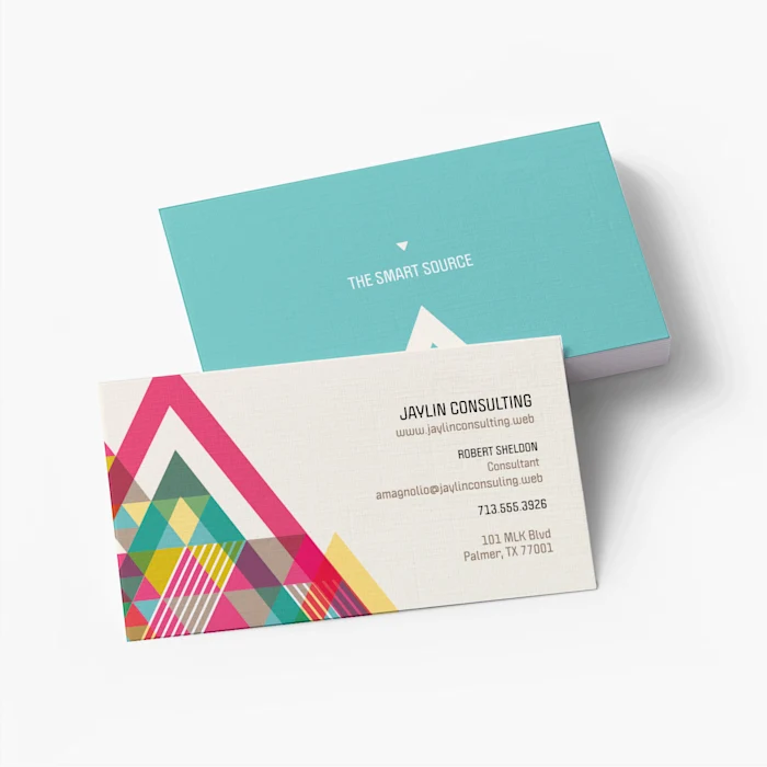
Cluttered business cards can feel overwhelming. Strategic use of white space (negative space) enhances clarity and elegance.
Tip: Aim for a balance between design elements and empty space to keep your card readable.
3. Orientation: Vertical vs. Horizontal
Most business cards are horizontal, but vertical layouts can make a unique impression.
Tip: If your brand is modern or artistic, experiment with a vertical design to stand out.
4. Use of Visual Elements
Logos, icons, and subtle patterns add visual interest. However, they should not overshadow essential information.
Tip: Keep graphics simple and relevant to your industry.
Actionable Tips for an Effective Business Card Design
- Choose a color scheme that aligns with your brand’s identity and message.
- Use a readable font combination that enhances professionalism.
- Ensure key information is easily accessible and not buried in design elements.
- Opt for high-quality printing and paper stock to enhance tactile appeal.
- Consider finishing options like embossing, spot UV, or foil stamping for added sophistication.
Final Thoughts
Your business card serves as a mini representation of your brand. By understanding the psychology behind colors, fonts, and layouts, you can create a business card that leaves a strong and positive impression. Applying these principles will enhance your brand’s credibility and effectiveness in networking situations.


